iMPRINT Marketing Site

A design for a marketing site that promotes the IMPRINT art protection app through a sophisticated, responsive web experience.
Case study
Project Overview

As a follow-up to the BrainStation Capstone project, this 1-week design brief called for the development of a single-page responsive website, designed to communicate IMPRINT's value proposition to its target demographic.
Type
Guided Case Study
Academic
Tools
Figma, Photoshop
Timeline
Spring 2022
1 week
Platforms
Responsive Web

01 / 03

Branding

Moodboarding

Referencing the visual styling previously established for IMPRINT, I began by expanding my existing mood boards, adapting them to the purposes of building a marketing website.
02 / 03

Ideation

Sketches to Wireframes

Next, I used sketches to quickly explore iterations for the responsive web layout, visualizing possible ways to convey the app’s purpose and value proposition on a website.

I also considered ways to incorporate dynamic motion graphics and 3-dimensionality to  spark excitement and bring the experience to life as the viewer scrolls through.
[ READ MORE ]
I also took the chance to begin drafting copy text, asking myself: if I were trying to pitch this in an elevator, how would I speak about it succinctly?

Building on each previous sketch, additional layouts were explored iteratively, continually referencing the UI inspiration boards while trying different ways to show content.

Finally, I compiled the more compelling exploratory sketches into a visual breakdown that would guide me through the development of my wireframes and prototype.
03 / 03

Prototype

High-Fidelity Development

Transitioning to high-fidelity involved sourcing additional mockup assets, refining the copy, and injecting colour to bring the website to life.

This was also the point at which I began to inject motion graphics to supplement the strategy of directing the viewer’s attention.

Both of the animation used were in reference to the iMPRINT app itself: a “stacking” animation that communicates the compilation of the artwork, and a looping “radial pulse” to indicate the scanning process.
[ READ MORE ]
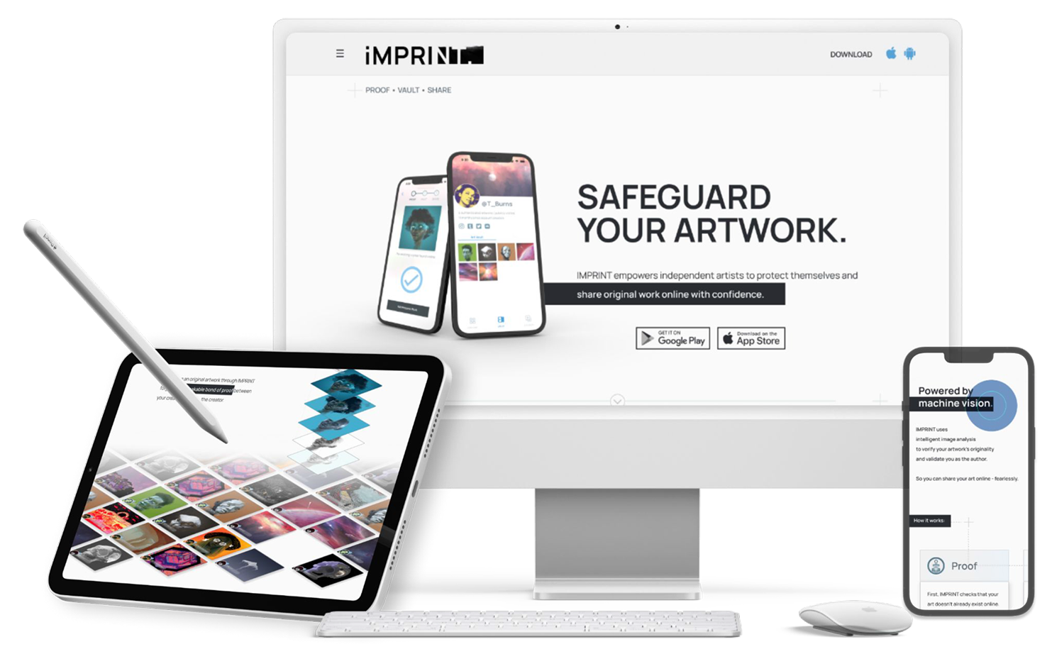
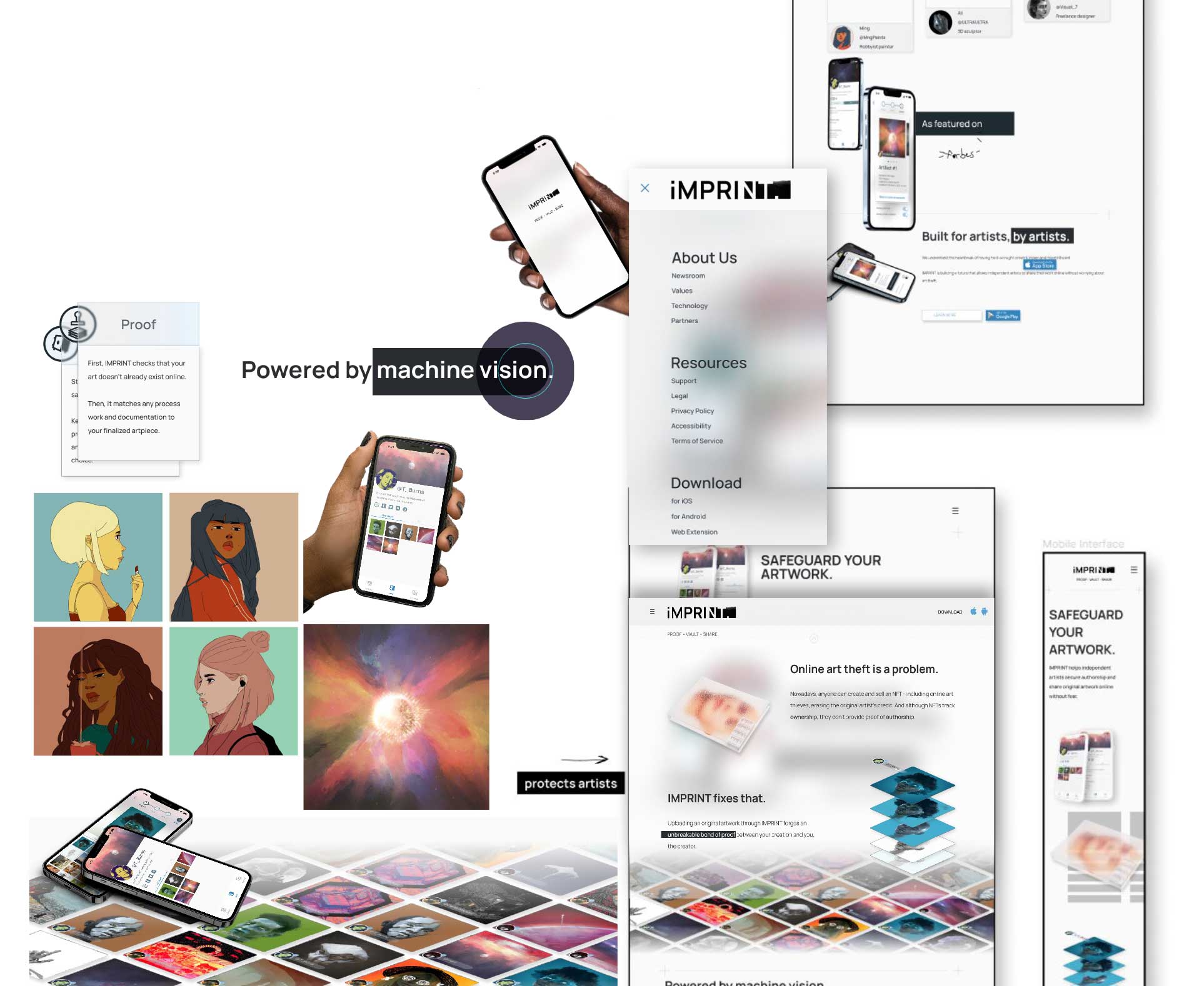
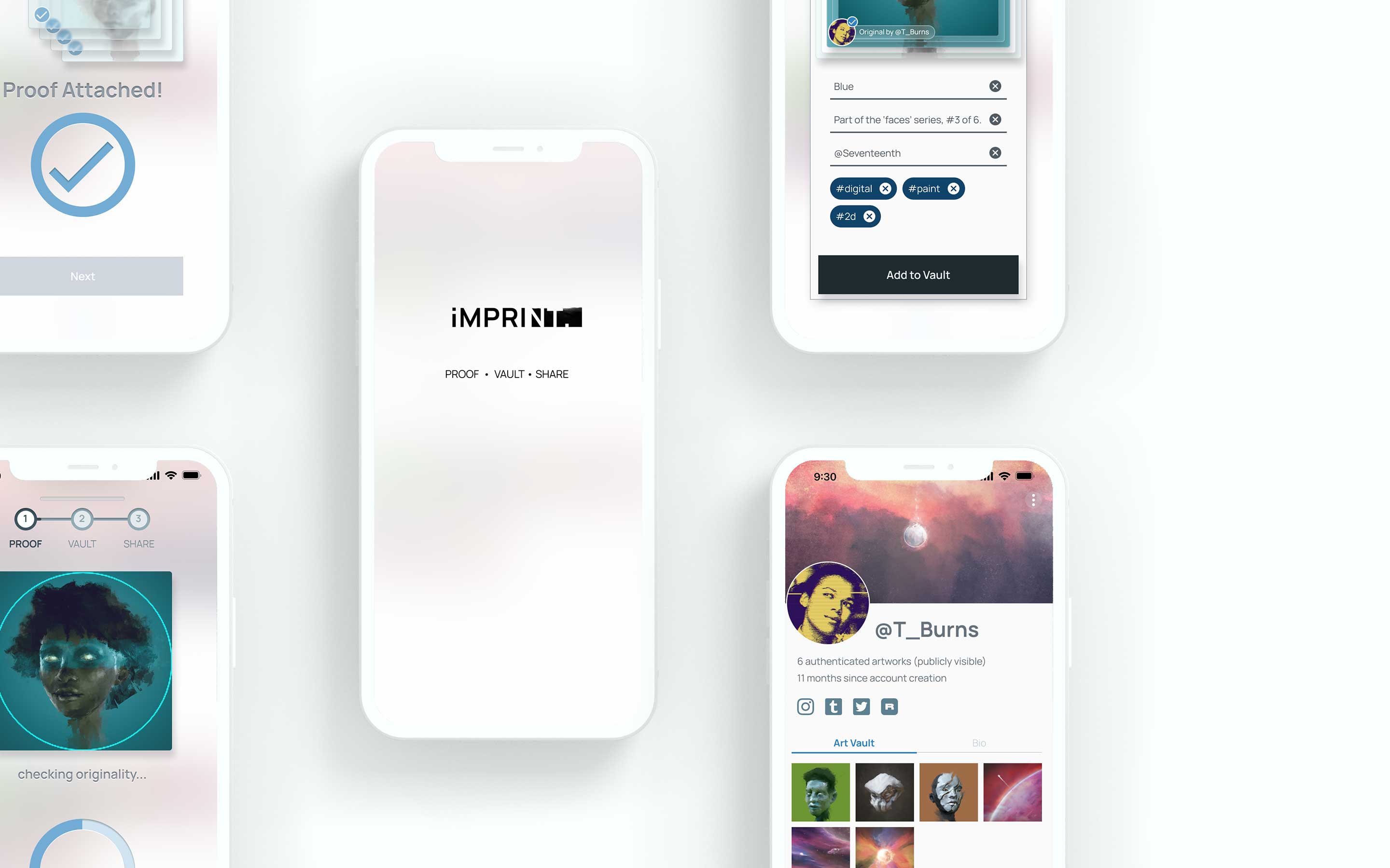
As I did with the IMPRINT project, I continued the trend of using my own art to fill out the “art gallery”. I also sourced additional artwork from my partner in order to convincingly simulate an active, creative community with diverse art styles.

Emulating the stark, controlled visual aesthetic of a modern art gallery and allowing vibrant art to take center stage helped to emphasize that this is a product that’s more about the art and the artist than the app itself.

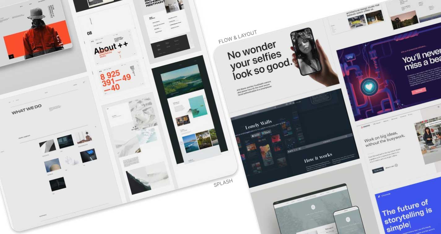
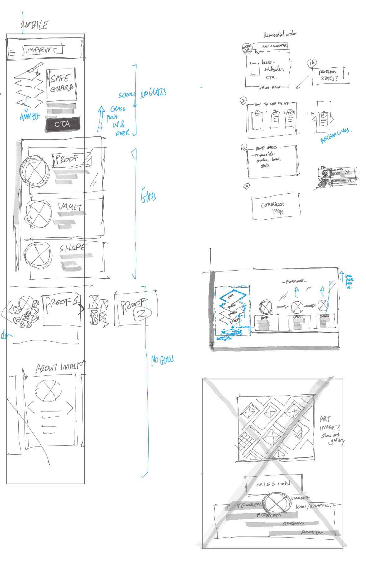
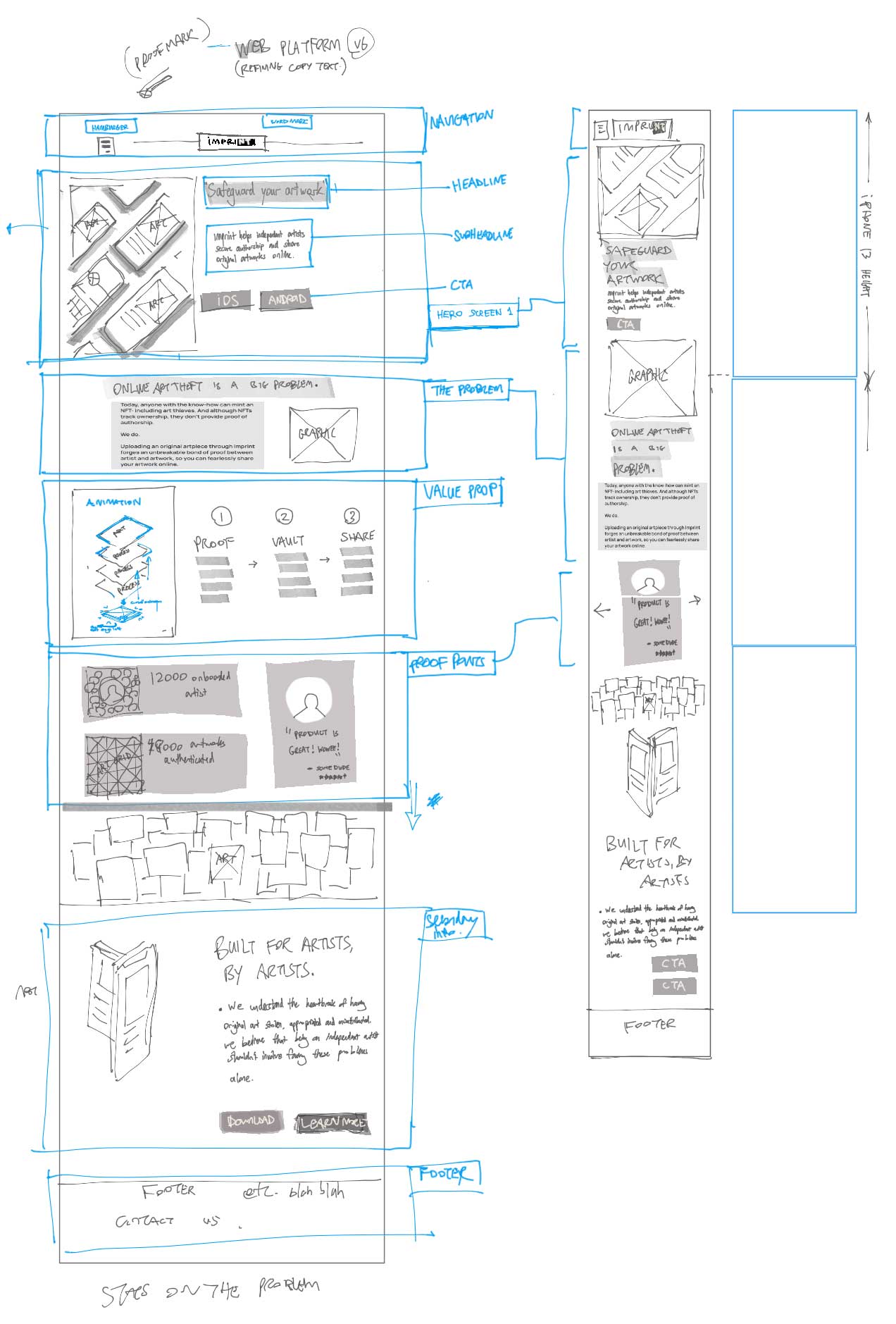
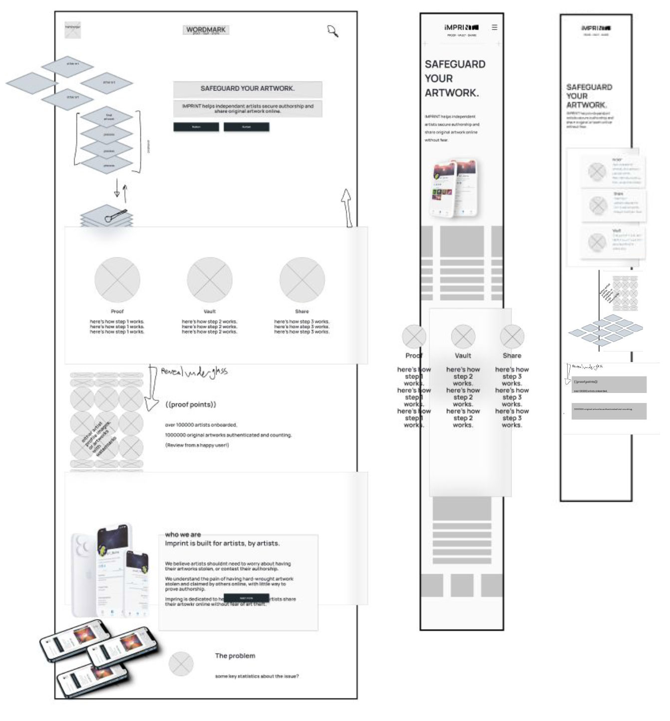
As with the previous steps, the process was guided by referencing the precedent boards as well as the established brand of the product.

(Re)introducing iMPRINT.

Looking Back

Credits


I am indebted to the invaluable guidance of the BrainStation educator team, the generous contributions of my interviewees and user test participants, and the thoughtful feedback of the BrainStation UX 'Icons' cohort of January 2022.

Special thanks to Cayley Black for allowing me to use her original artwork.


Key Learnings

01
Build a Narrative Arc
Creating a marketing site for my product felt like a great opportunity to expand on the ideas that I’d been bursting to expand on, but couldn’t fit into the flow of the app itself. "Selling" the product to a hypothetical user through the medium of a website was the perfect opportunity to structure these ideas.
02
Empathize with the Audience
At the same time, it was important to be mindful of the web medium and the likely behavior of the viewer, and never to assume that they’d start off with any sort of emotional investment in the project. In addition to appearing credible, I had to give them reason to care.
03
Narrow the Scope
As I trimmed and refined content, the project became an exercise in trying to keep the imaginary viewer engaged, and continually asking myself- have I given them enough reason to actually read this copy? If they’re skimming over it, do the headlines and graphics still give them some idea of the product purpose? Do the animations help clarify the content, or is it just distracting eye candy?

next project :

iMPRINT.
BrainStation Capstone Project