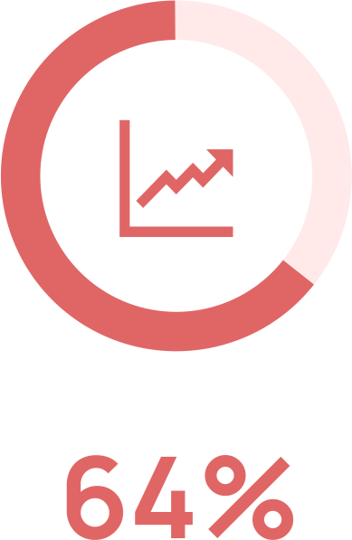
of art dealers made their sales online as of 2017.
"Art ecommerce is projected to ‘continue & likely accelerate.’ "
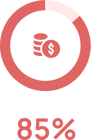
of images shared online each day are used without a valid license.
This causes upwards of
€532.5 billion
in damages daily.

of photographers surveyed in 2016 self-reported as victims of image theft.
...of that number, 33% did not seek legal recourse, finding it too daunting.
.png)
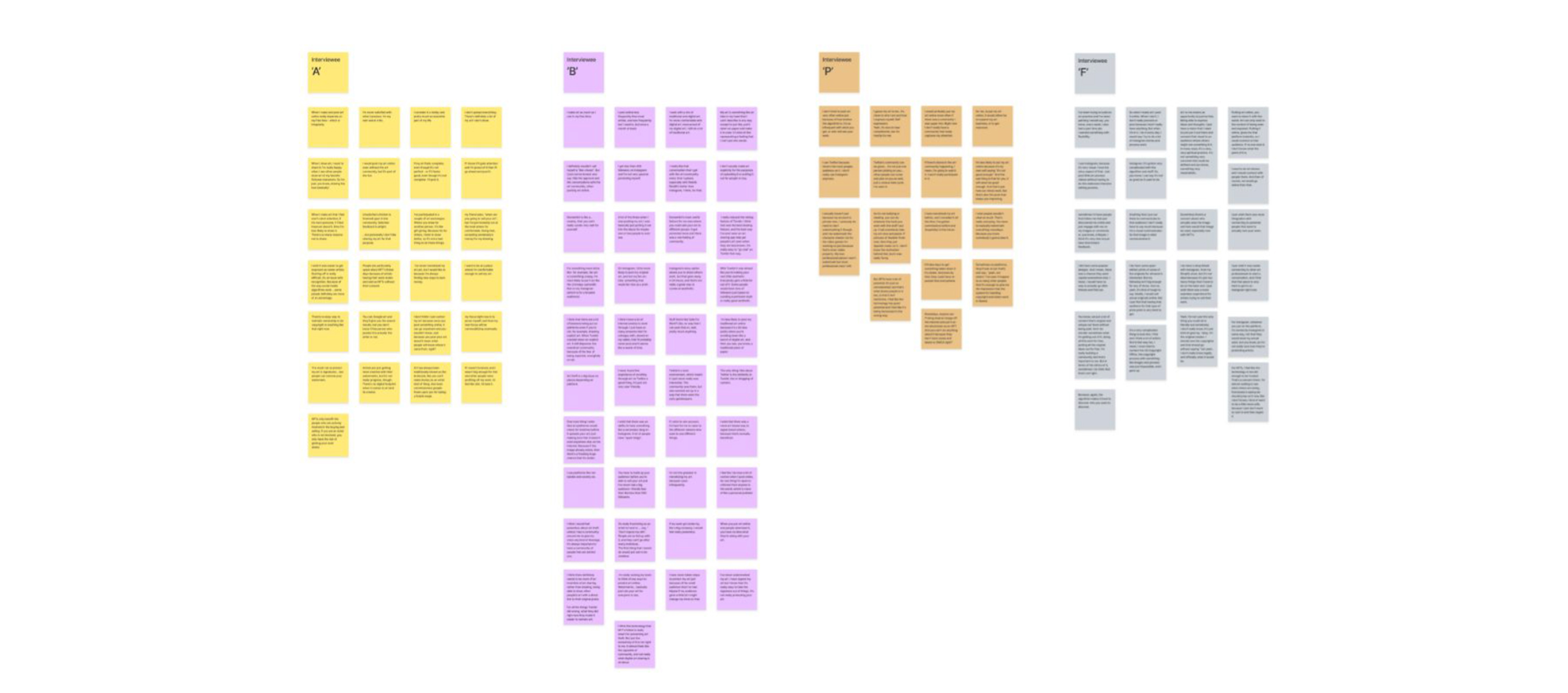
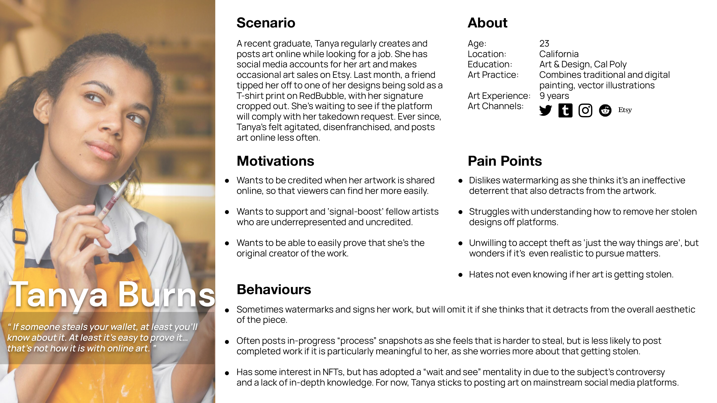
"I'm never satisfied with what I produce. I'm my own worst critic."
Korean-Indonesian female who recently self-taught digital art.
She's an active participant in the online art community, who wants to monetize her art.
.png)
"Art is like representing a feeling I can't put into words."
Canadian female, works with digital and traditional art, self-taught since age 13.
She has monetized art via physical prints, merchandise, and commissions.
.png)
"Art can only exist in the context of being seen and exposed."
Canadian female, professional illustrator who works with traditional art.
She has a part time art practice and over 10 years of experience selling and showcasing work.
.png)
"NFTs have a lot of potential... I feel like it's being harnessed in the wrong way."
Canadian female studying Game Arts, works with traditional and digital art.
Monetizes commissions.
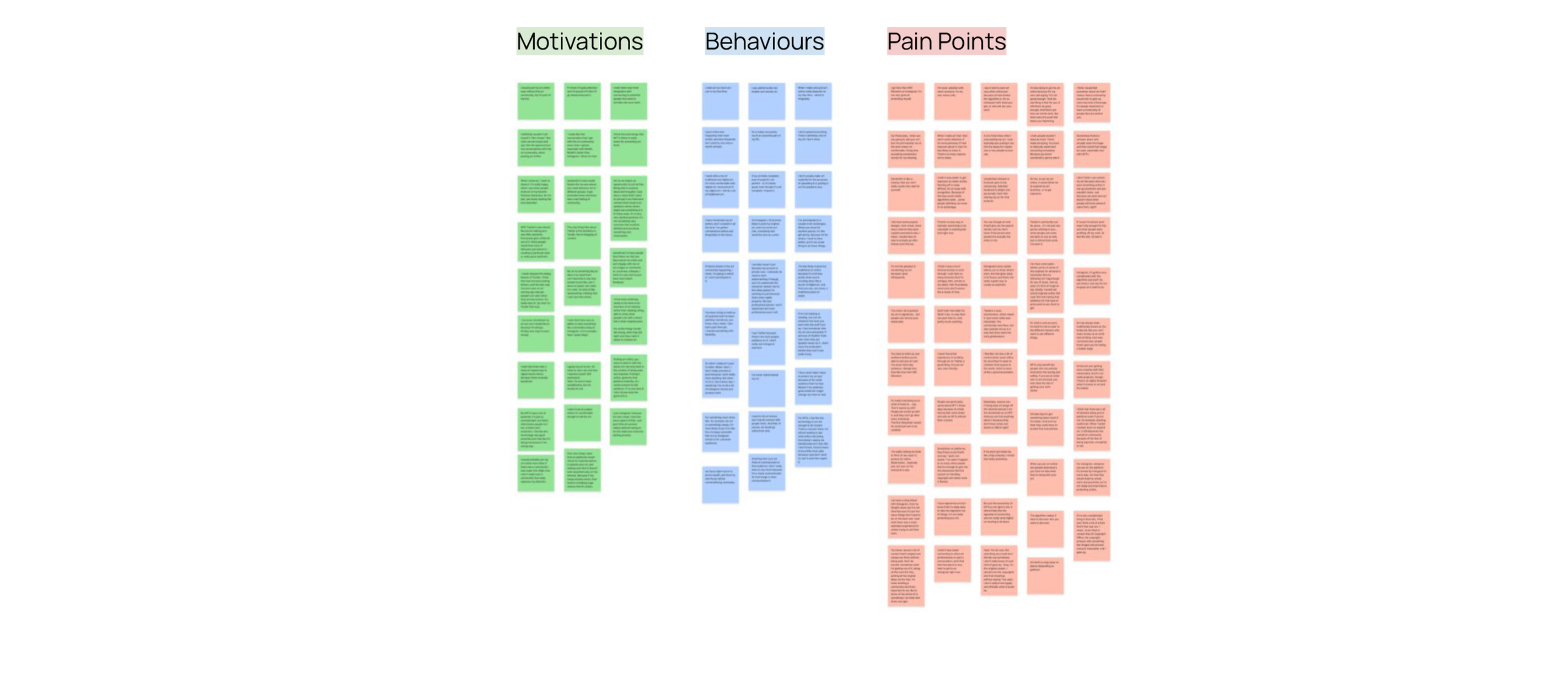
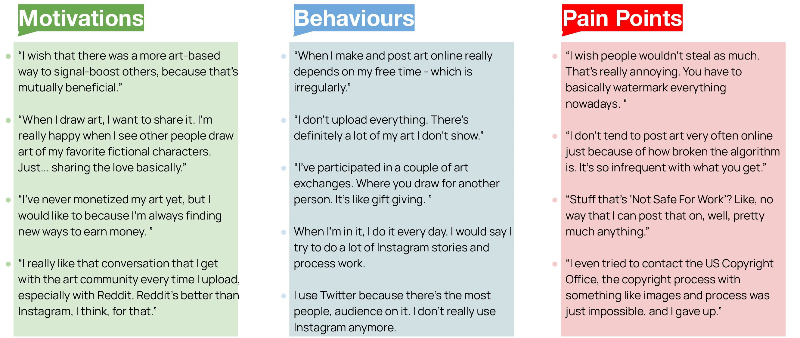
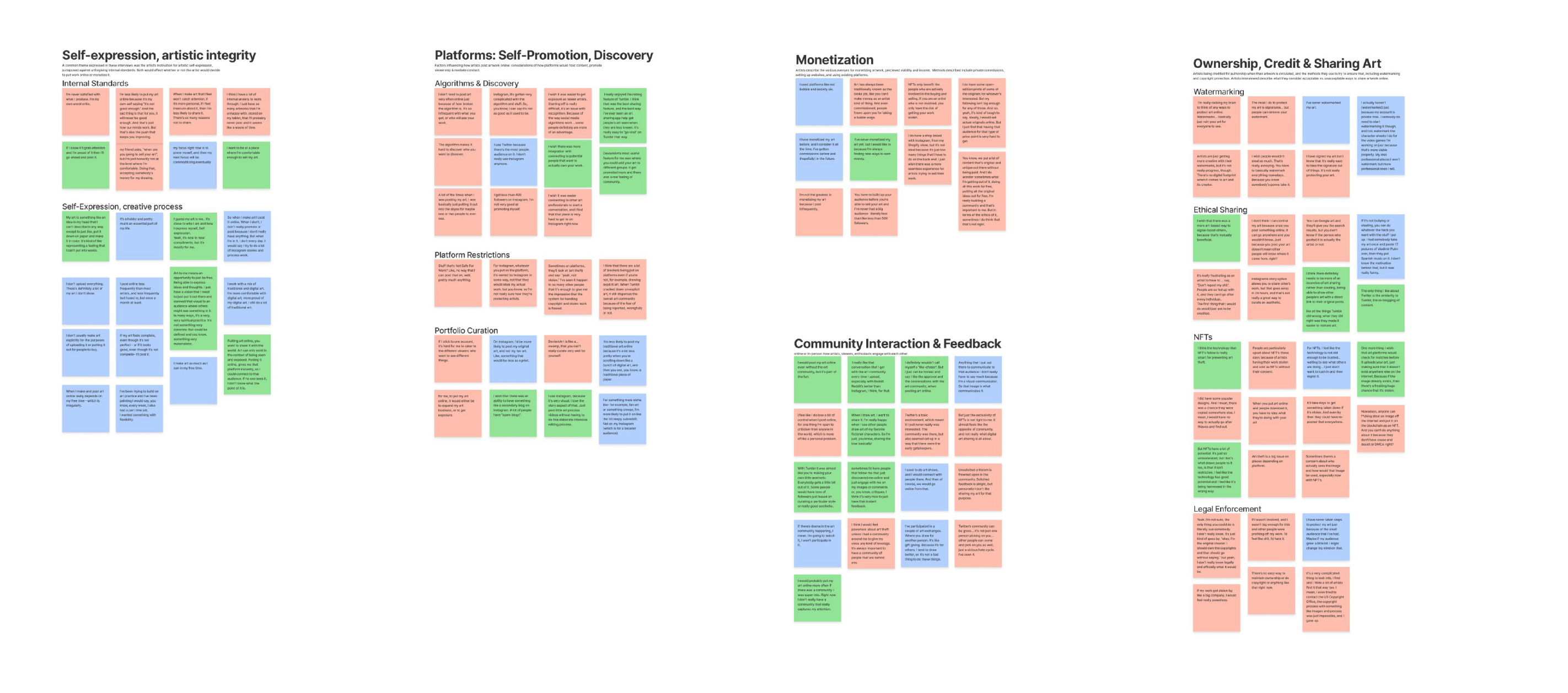

Interviewees were very conscious of the role that online platforms play as content hosts and mediators. There was dissatisfaction with the way platforms protect and promote online artists.

All interviewees professed some level of interest in monetization, but none considered their artwork as a viable source of income, nor did any of them consider it the main motivator in creating and posting artwork online.

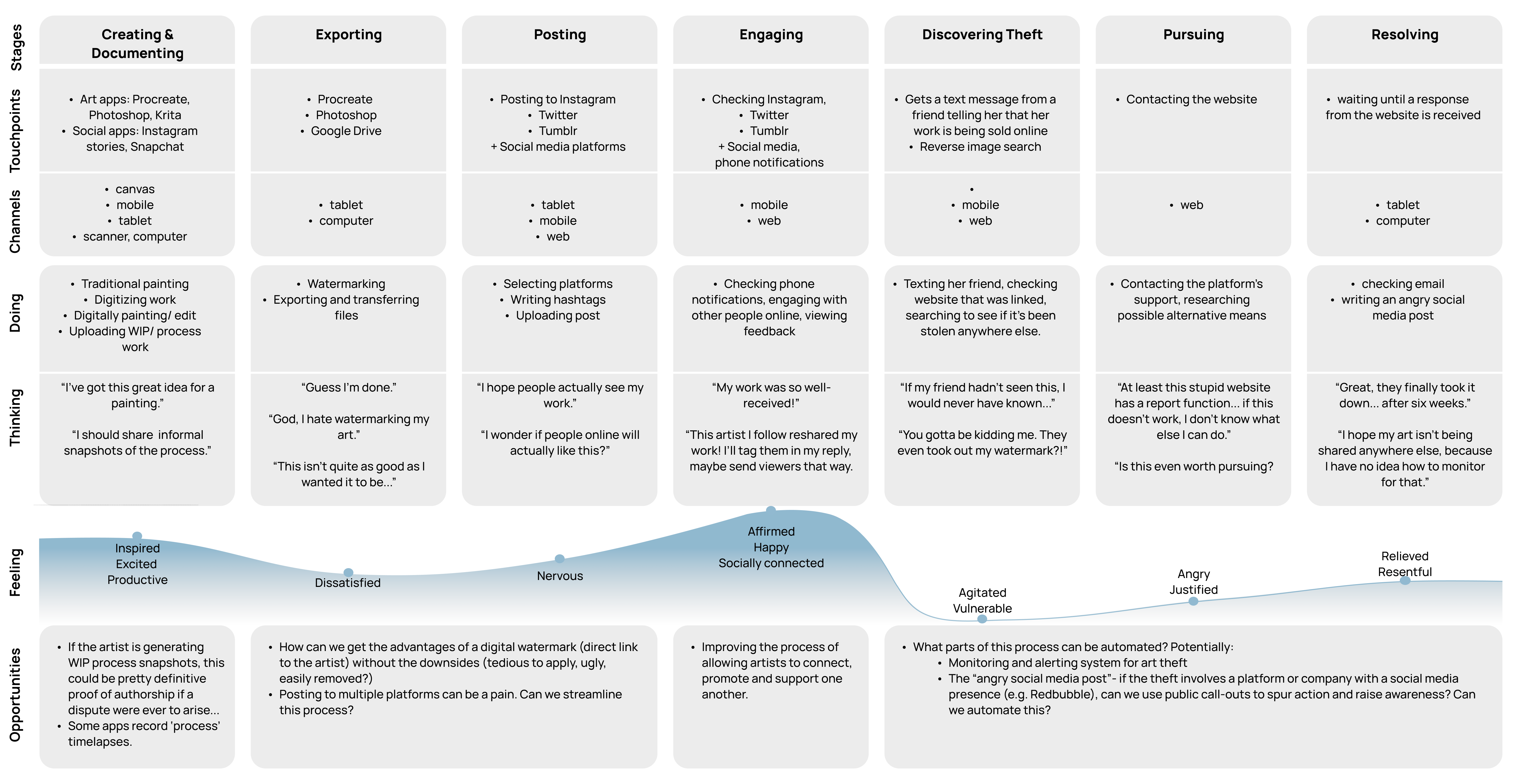
(Selected Insight)
Rather than seeking to restrict recirculation of their work or collecting royalties, interviewees indicated the priority was to simply ensure that their artwork was properly credited when shared.

Artists engage with online viewers for various purposes, including for approval, soliciting criticism, common interests, and mutual exchanges of original art. There were also concerns over online toxicity in the art community.

A common theme expressed from the interviewees was the artist’s own motivation for creative self-expression, alongside unforgiving internal standards.

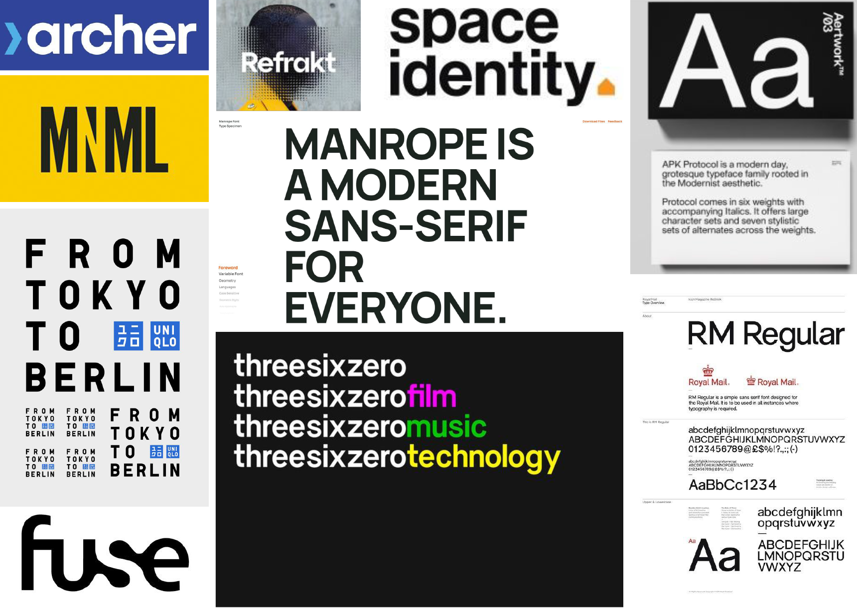
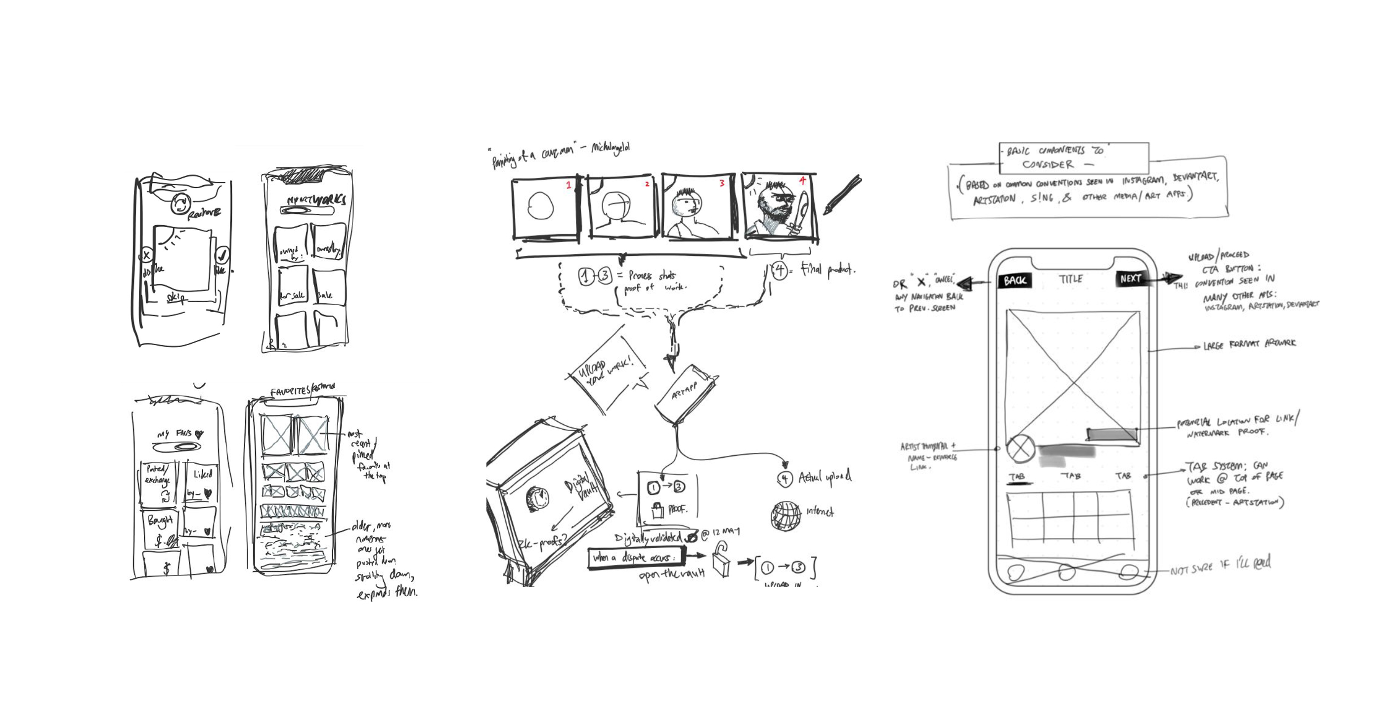
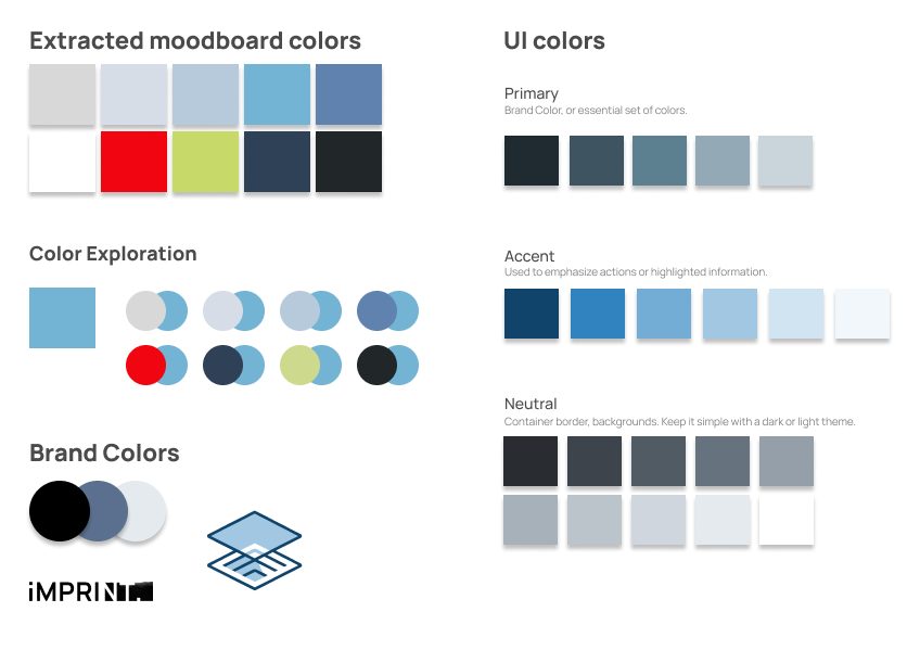
In keeping with the brand’s values, both wordmark and system fonts should appeal to artists by expressing modernity and simplicity.
Sans-serif fonts in the geometric or grotesque styles fit these requirements. I settled on the Manrope sans-serif typeface, conveying the idea of modernity and clarity. Colorized versions were also considered, but discarded in favor of a strong black/white contrast.
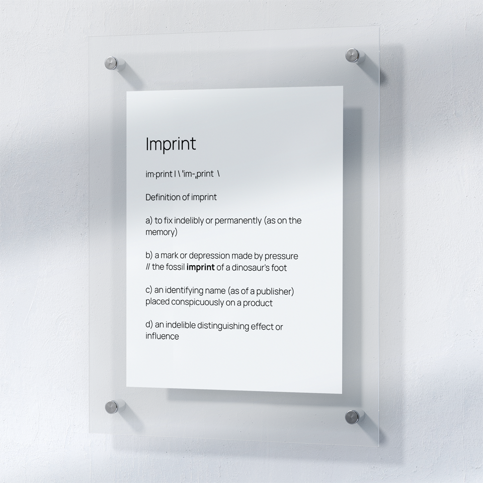
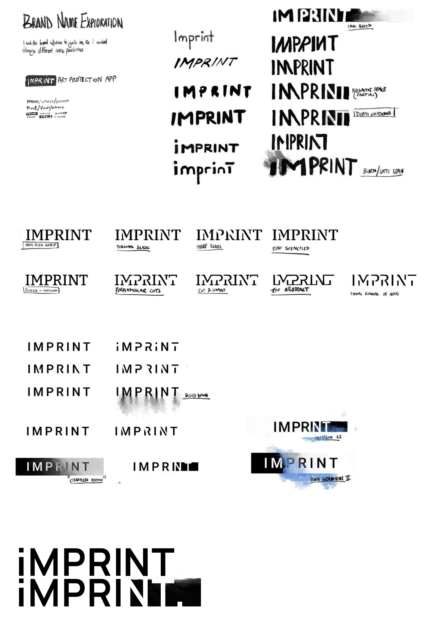
I used the Procreate app to explore operations on the wordmark, centered around emulating physical or art-based processes: ink bleeds, watercolors, and wood-burning, to allude to the idea of imprinting as a physical, indelible process.
Consulting with peers and members of the artist target demographic helped me choose the final version to continue developing, which inverts black and white to express the idea of engravings and punch-outs. The first “I” is switched to lowercase to make it feel less brash than an all-caps option. A ragged, “inked” edge on the blackout is a nod to the art focus of the app.
Finally, to emphasize the brand’s dynamism, I explored a two-stage, black & white animated wordmark that reveals the inversion and stylized period at the end of the transformation.
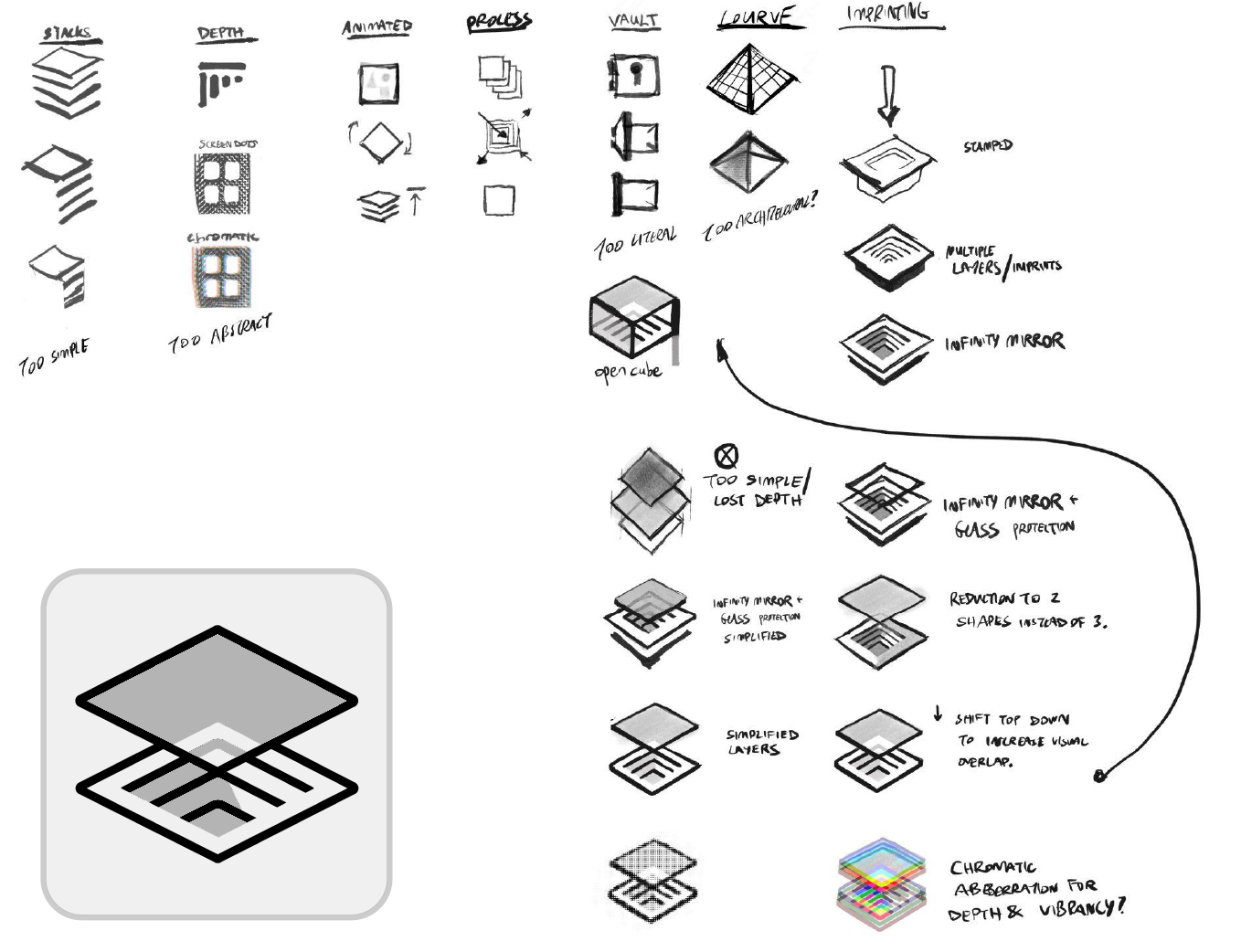
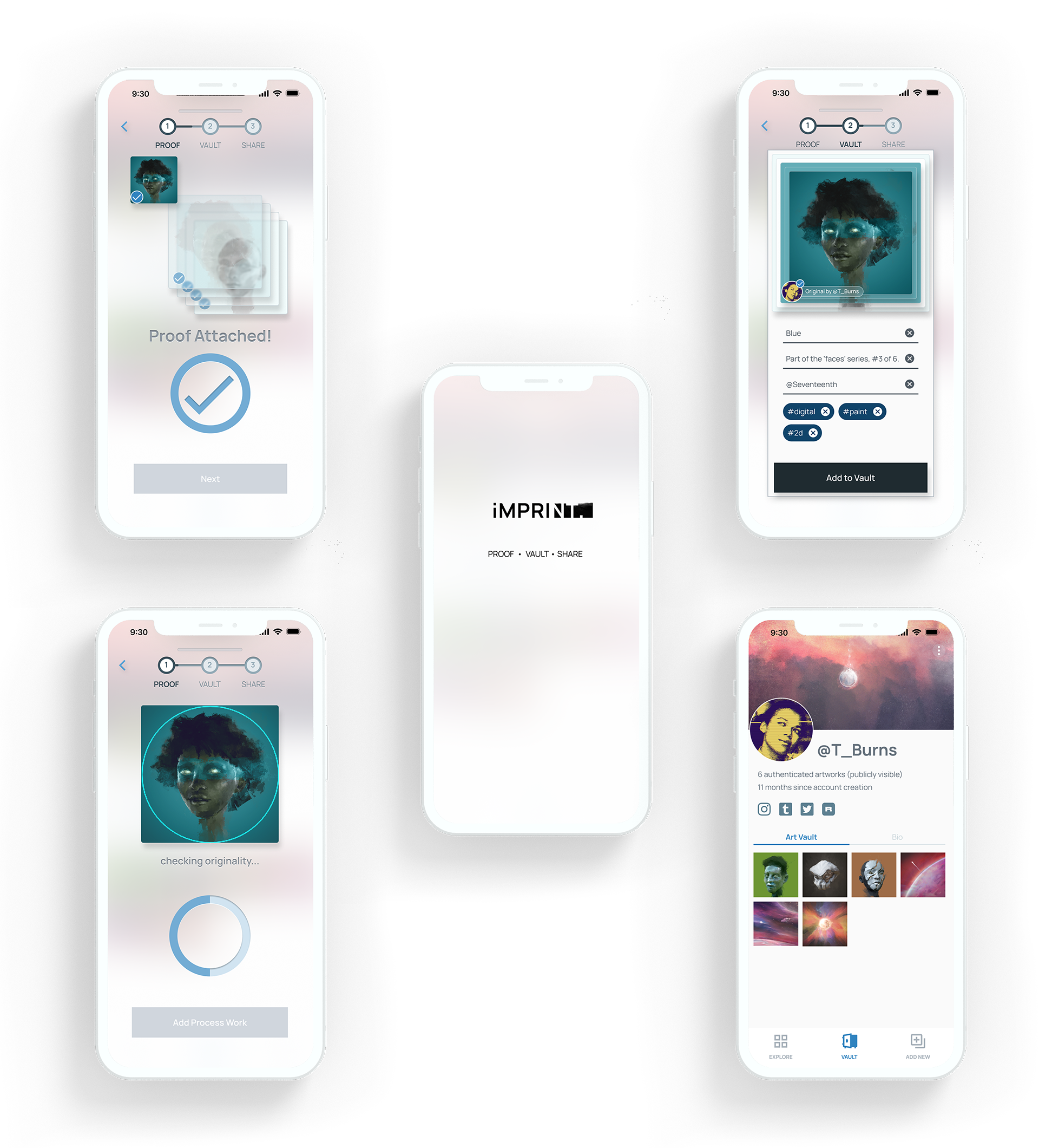
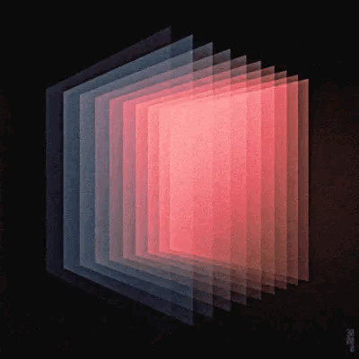
The app icon that would appear on a mobile home screen should ideally be simple while conveying the purpose and brand of the app. A number of metaphors and abstractions were explored, including ideas of lamination, engraving, vaulting, stamping, and a nod to I.M. Pei’s Louvre.
The eventual icon selected for vectorization was a geometrically simple, axonometric visual of an engraved surface with a translucent layer hovering above, abstract enough to work at a small scale while still encompassing the brand.
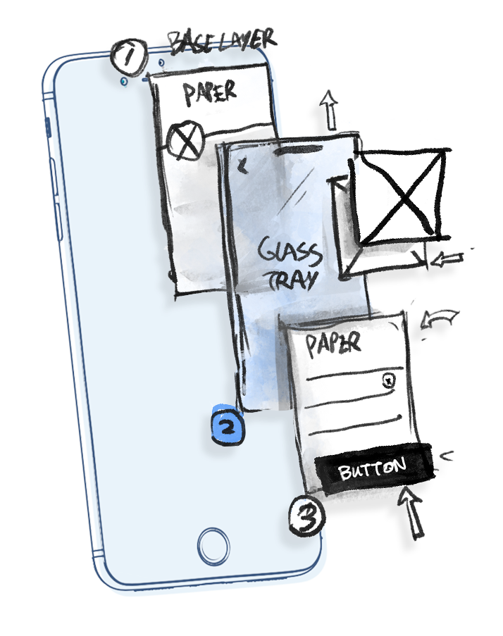
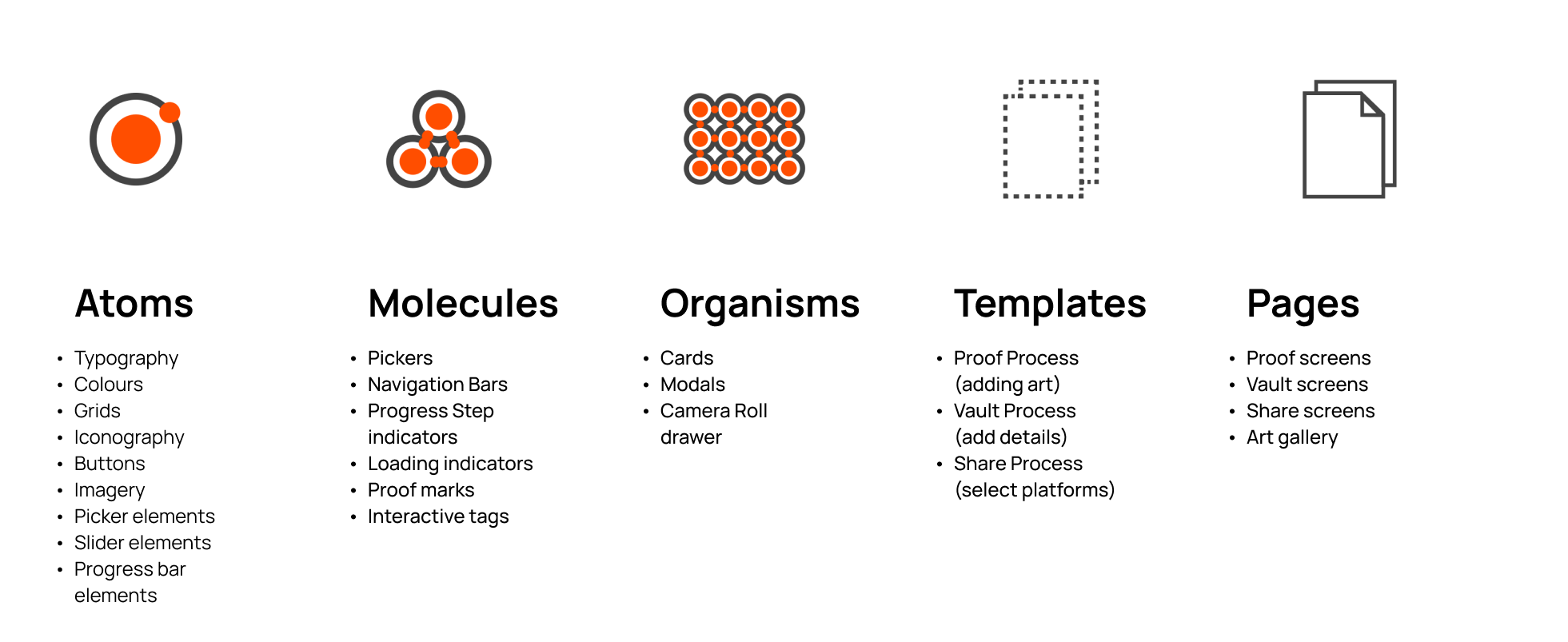
As I moved through color injection and began building the hi-fi prototype on the Atomic Design system, I explored a design rationale that focused on applying translucency and consistent layers, drawing inspiration from both Android’s material design and Apple’s iOS visuals.
The intent was to express the product as an elegant, subtle machine that could also fade into the backdrop and allow the vibrancy of the art to take center stage.
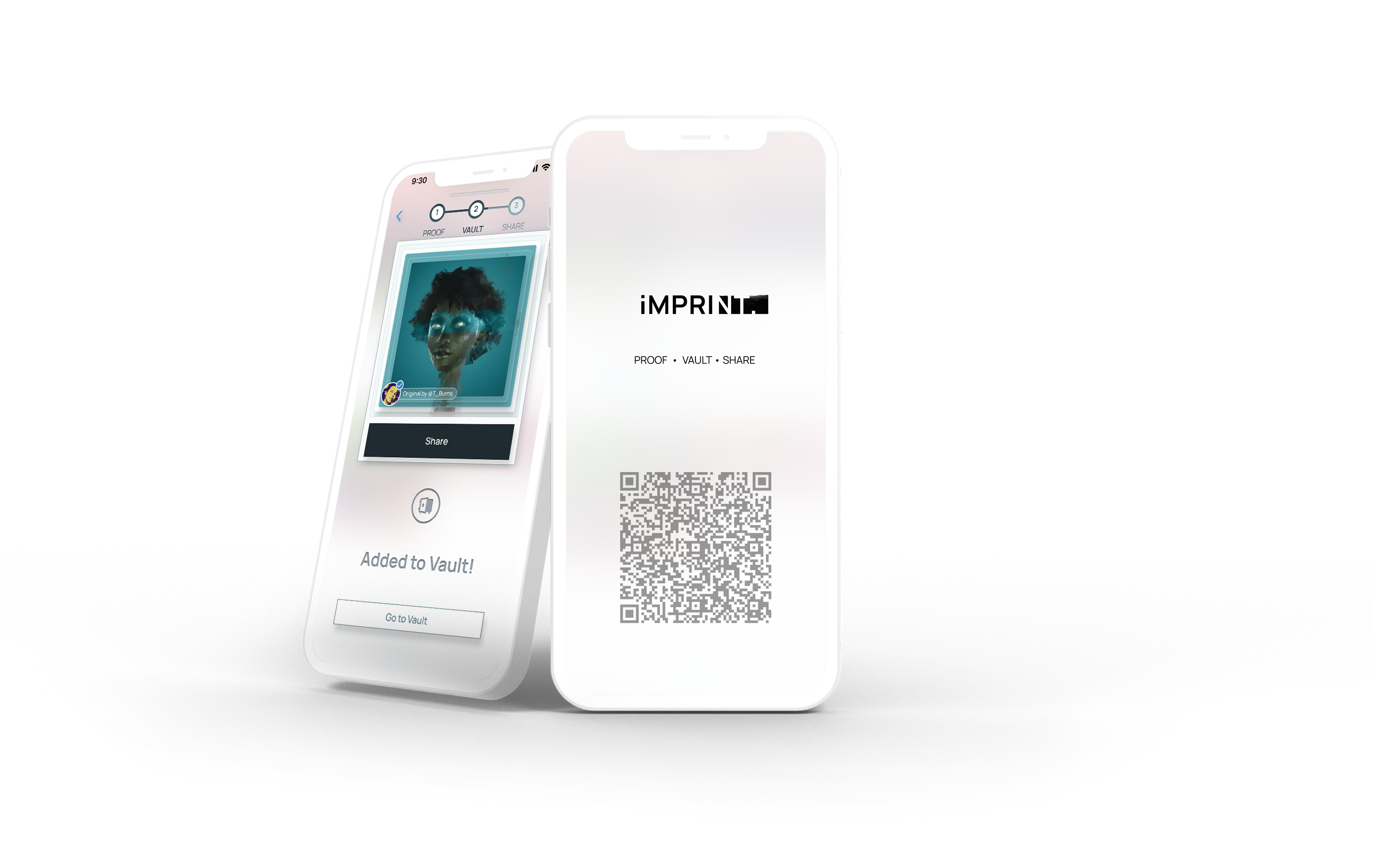 LAUNCH PROTOTYPE IN-BROWSER
or scan the QR code to try it out on your mobile device.