Pantone redesign

A heuristic evaluation of Pantone's web platform in order to uncover usability issues, implement design improvements and produce a redesigned working prototype.
heuristic evaluation
Project Overview
Working alongside a team of 3 other UX designers, I conducted a heuristic usability evaluation of Pantone's website.

Heuristic evaluations are a method of finding usability problems in a user interface, and involve having evaluators examine the interface to judge its compliance with recognized usability principles.
Type
Heuristic Usability Evaluation
Tools
Figma
Timeline
2 weeks
Spring 2022
Roles
UX Research, UX Design

01 / 02

Discovery

Mapping the User Journey

To define the scope of our evaluation and provide context, we began by crafting a scenario of a user looking to purchase multiple items on the website.
02 / 02

Evaluation

Identifying Issues & Recommendations

Referencing Nielsen Norman Group's 10 Usability Heuristics, our team conducted a heuristic evaluation through the task flow, highlighting usability issues and assigning severity ratings based on impact, frequency and persistence.

We then mocked up improved designs for 6 major areas that required improvement.
Issue #1: Search Takeover
There is no system feedback when there are no search results found, leaving the user confused.

Recommendation: Added "no search results found" message, and suggested search results.
Heuristic Violations identified:
- Visibility of system status
The system should always keep users informed of what is going on through appropriate feedback within reasonable time.
- Help users recognize, diagnose, and recover from errors
Error messages should be expressed in plain language (no codes), precisely indicate the problem, and constructively suggest a solution.
Issue #2: Product List Page - Prices
When the user hovers over an item, the action buttons that appear obscure the price.

Recommendation: Moved the action buttons below the product description. This allows the user to view the price information that was previously hidden.
Heuristic Violations identified:
- Recognition rather than recall
Minimize the user's memory load by making objects, actions, and options visible. The user should not be made to remember information from one part of a dialogue to another. Instructions for use of the system should be visible or easily retrievable whenever appropriate.
Issue #3: Product List Page - No Stock
The user can only view what is out of stock when hovering over the item.

Recommendation: Added persistent context info that does not cover product description and price. The new out of stock indicators have been changed to buttons that allow the user to opt into "item-in-stock" notifications.
Heuristic Violations identified:
- Recognition rather than recall
Minimize the user's memory load by making objects, actions, and options visible. The user should not be made to remember information from one part of a dialogue to another. Instructions for use of the system should be visible or easily retrievable whenever appropriate.
Issue #4: No 'Breadcrumb' Navigation
While the website does provide breadcrumbs elsewhere, there is no way to go back when clicking into a product page.

Recommendation: By continuing to use breadcrumbs to the product page, it allows the user to return to their search without having to start over from the home page.
Heuristic Violations identified:
- User control and freedom
Users often choose system functions by mistake and will need a clearly marked "emergency exit" to leave the unwanted state without having to go through an extended dialogue.
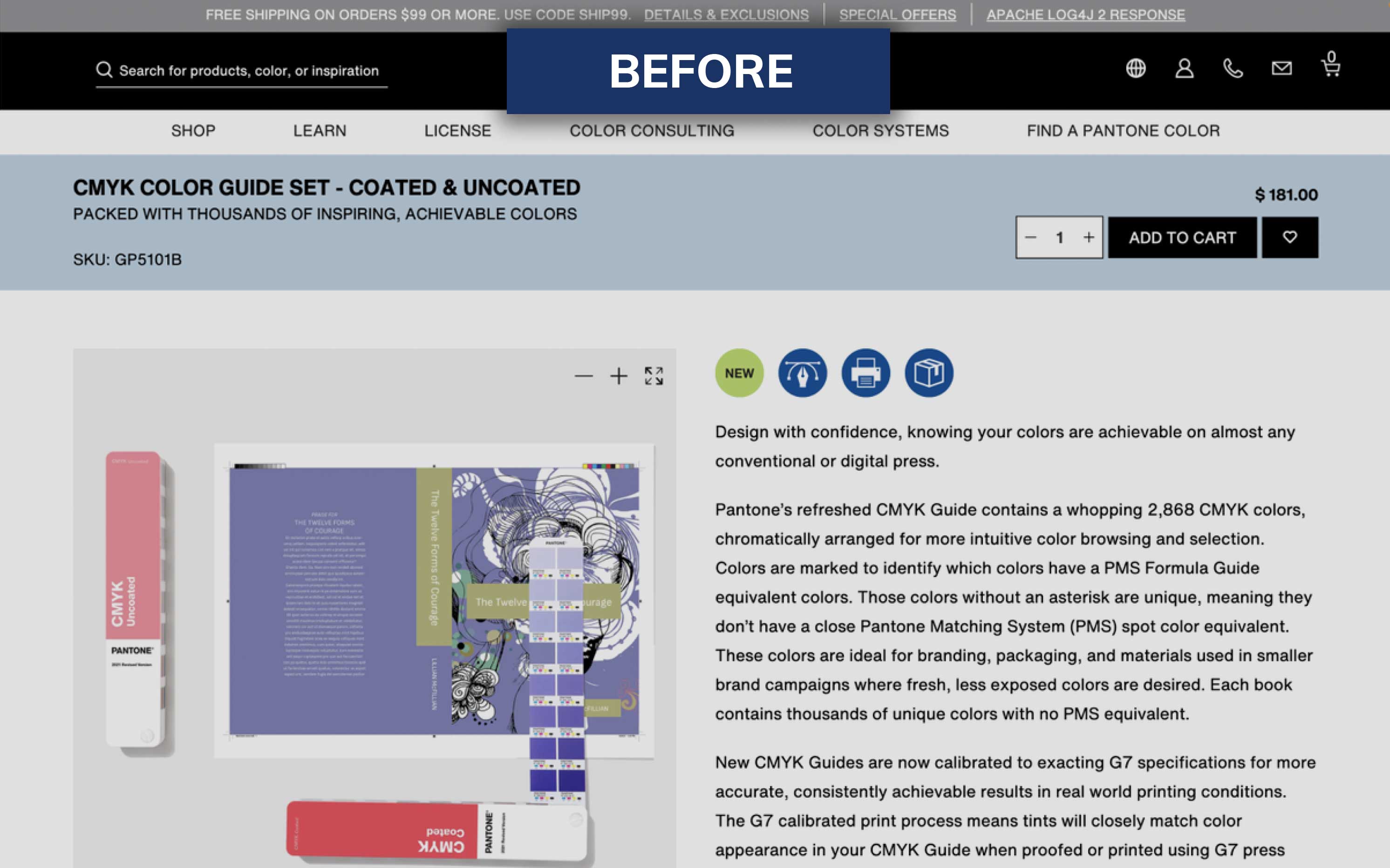
Issue #5: Confusing Icons
Icons do not readily correspond to any recognizable objects or conventions, and lack clarifying labels. There is no meaning assigned to icon colors. For instance, it is unclear if they signify a toggle state.

Recommendation: Added labels to the icons to provide the user with context. Removed color from the icons to minimize potential confusion and make icons more accessible.
Heuristic Violations identified:
- Match between system & real world
The system should speak the user's language with words, phrases and concepts familiar to the user, rather than system-oriented terms. Follow real-world conventions, making information appear in a natural and logical order.
- Consistency & standards
Users should not have to wonder whether different words, situations, or actions mean the same thing. Follow platform conventions.
Issue #6: Checkout Portal Navigation
When the user clicks the check out button, there is no way for the user to go back in case they want to edit their cart.

Recommendation: Added a back button the the checkout portal to enable to user to freely exit whenever needed.
Heuristic Violations identified:
- User control and freedom
Users often choose system functions by mistake and will need a clearly marked "emergency exit" to leave the unwanted state without having to go through an extended dialogue.

Looking Back

Credits

This project was a collaborative undertaking, and I was fortunate to benefit from the talent and camaraderie of a fantastic team of designers- Enrique Magno, Janesa Chan, and Mark Zamora.

Key Learnings

01
Client Communication
Conducting a heuristic evaluation on an existing brand was a great opportunity to frame the presentation mindset in an 'agency to client' context.
02
Prioritize by Severity
By aggregating our team's results, we were able to identify both minor and major issues with a reasonable degree of confidence. On top of providing recommendations, this allowed us to emphasize which corrective measures should take priority for the greatest impact.
03
Design within Brand Constraints
Providing recommendations to resolve the site's issues allowed our team to redesign an existing product while adhering to the brand's style guidelines.

next project :

iMPRINT Marketing Website
Responsive Website Design